
in the end, i have add the ribbon inside my birthday card.
-firstly,i used the quick selection tool to select the ribbon and click Alt+c
to copy it into the card there.
-after done,i change the ribbon colour to purple colour using paint bucket tool and i stroke the ribbon with white colour.
-i also brush the whole card with brush tool with the leaf shape to make decoration the whole card,i have choose white colour of the pattern of the leaf because
the colour won;t too sharp and more suitable with the background colour which is pink colour.
- i also duplicate the cake layer to make the image looks more clear and the colour looks
nicer when it print out.

-lastly,type the Happy Birthday in other page and change the front.
-i have stroke the words and change the colour of the words.
in the end,i also add the wrap text effect on it the sentences there to make it
got some pattern.
- i used the arch pattern and adjust the bend,horizontal and vertical of the word.

-i have use a magic eraser tool to remove around the blank area around the cake.
-after that i check the stroke box and change the stroke colour to blur colour
-in the layer there,i right click and set the drop shadow effect to the cake there to make it looks more real.
-when done all,used move tool to move the cake's image to the side of the card.

-place another birthday cake into photoshop,before place it,i have edit the picture with the colour balance tool to edit the colour of the picture.
-after that i used free transform tool to adjust the size of the picture by hitting shift key.

after that,use rectangle tool to create a rectangle box and fill in with the pink colour.
-after done,use type tool to type in the happy birthday words and stroke it
-use the free transform tool to adjust the word that allow the word fit into the rectangle box.

after the decoration, the image looks more attractive compare there is only the cake
image inside the front page.
-in the bottom of the image,i use ellipse tool to cut out the snoopy image from the original image and hit Ctrl+V to paste in to the bottom of the front page.

only the cake image in the front page i think that picture looks too simple. so i use the brush tool to add some decoration.
go brush tool>select the no.55 brush to bush around the cake.
-change the brush colour to the colour that i think is suitable,in here i use f2c6c6 and 9ecfda.


Another birthday cake image are selected to put it into the second page of the birthday card.
-i use hue/saturation tool to adjust the colour of the cake,make the colour looks more soft and smooth.
-after that, i apply it into my birthday card and use the magic eraser tool to remove the extra area around the cake .
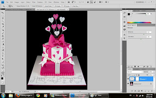
Select the birthday cake image as the front page of the birthday card..
-before i apply this image in the front page,i have do some photo retouching..
-i adjust the colour of the image to make it more clear and bright,
i have use colour balance tool to adjust the colour of the cake.

When done the first step,i try to create a grungy area using brush tool..
-create a new layer, change the foreground colour in to f4e447(light orange+yellow)
-after done selected the colour, i use brush tool to create a grungy effect,when doing the grunge effect, i keep change the direction and the size of the brush.
-after apply the grungy effect, i start to put some words into that area,
since this is a birthday card, so i just type the word happy birthday using type tool and change the front to Lucida Handwriting size 18pt.
-after type the words,use free transform tool to adjust the word,Ctrl+T to readjust the colour of the word and the space between each word.
-when done,just hit Alt key and click the word to copy it into whole grungy area.

Create a background...
-i create a A3 size layout and set the colour to CMYK...
-change the background to purple colour
-after that i go Image > Image Rotation > 90' CW to rotate my layout.
-use the line tool the separate the page into two pages since we need to design a card,
i press the shift button while i drag the line to make the line straight.
-after separate the page,i use the brush tool to make an


