BLOGGER TEMPLATES AND TWITTER BACKGROUNDS

Monday, December 13, 2010

asgn2 -final


final output...
FOM open day wallpaper....

assignment 2 -tools


use the selection tool to select the picture, the use the brightness or contrast tool to change the picture's colour look more bright and more nature.


in the notice board there got a paper paste on there,
to make it look more good,i decide to use clone tool to clone the paper and make it become all in black colour..


after clone, the paper are missing...


add in the second photo..
use the same tool,brightness or contract and colour balance tool to make the colour of the photo become more bright because the picture got a bit look dark since it took on evening.


after type in the words, i use the layer style to adjust the word and make some effect on the
word there make it look more attractive..the effect i using is drop shadow..


play with the layer style also, but this time the words"open day" i have used the inner shadow to make the effect...


in the last picture, i have play with the layer style, and this time is outer glow
and the picture i have use the colour adjustment to adjust the colour..


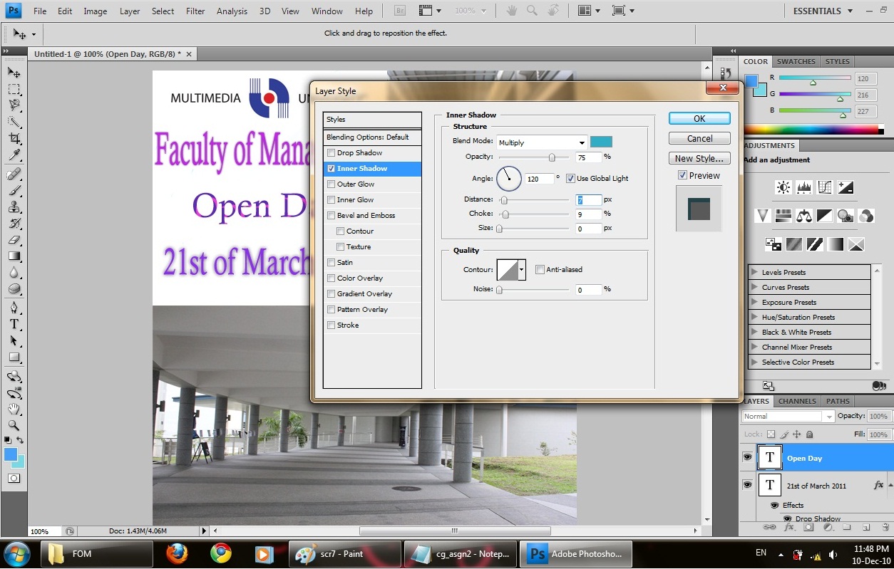
in the filter there, i try to find so me leaf as the decoration for the wallpaper,
and i also try to drop shadow on the left the make it look more
"3D"...


in the end, i duplicate the 3 photo's layer to make the picture look more clear...
done..


Thursday, December 9, 2010

Assignment 2-photo retouching

i have choose 3 photos as my wallpaper picture...


Tuesday, November 23, 2010

asgn-1 done


done!!!
but it look weird...haha


Thursday, November 18, 2010

asgn 1-process

the tool that i have been used in this assignment:
-quick selection tool: for select the part that i want
-move tool: move the image that i selected
-elliptical marquee tool: select the round shape image
-magnetic lasso tool: select the part of image that i want
-zoom tool:use to zoom in and out before and after select certain part of image


i use the magnetic lasso tool to select certain part of the orange slice and copy it into
my other window and use move tool to adjust the size and also the direction.


garlic-the hat..
after select the garlic image and copy it into layer, i try to adjust through refine edge, to make
the curve move smooth and look nicer.


watermelon,before i define edge, i make the color of the watermelon look more fresh,
i go image>adjustment>color balance to adjust the green colour.
after done, i define edge to make the side look more smooth and nature,
after done, i duplicate the watermelon layer to make the watermelon image look more sharp
compare with only 1 layer..


watermelon that i select to be the face, using quick selection tool to select the watermelon.

Friday, November 12, 2010

MCG2- asgn1(chosing image)


a water melon as face...


a garlic as the hat..


chili as the beard


carrot slice as eye

black current as eye also

orange slices as mouth

Monday, November 1, 2010

Computer graphics 2

Computer graphics 2,
in MCG 1024, we learn about photoshop...
yeah...^^

Sunday, September 5, 2010

asgn-final


asgn3- tool

in complete this birthday card,
i had used tjose tool:
-selection tool to move the image
-type tool to type the word i want
-line segment tool to draw the cake and the cap.
-ellipse tool to draw the rainbow as my background.
-blob brush tool to draw to root of hibiscus.
-symbol spray tool to duplicate the hibiscus and the grass
-gradient tool to make the colour effect on birthday card.
-eyedropper tool to detect the colour i used before.
-live pain bucket tool to colour my image.
-graphic styles tool to make the effect.
-symbol tool to find the symbol i want.
-transparency tool to opacity some of the image
-brushes tool to adjust the hibiscus's root size.

asgn3-process


add the grass as decoration.

add the rainbow as my background. i draw this rainbow using ellipse tool
this hibiscus take from symbols tool, after that i recolour the hibiscus and drop some effect on it.


the ballon contain colour effect using gradient tool and added the work using type tool

after colour the birthday, i added a malaysia flag as the decoration


draw so balloon in the sky and type in the word inside the balloon


i add some hibiscus as my birthday card background because hibiscus represented Malaysia's flower

add the birthday cake and colour it

the effect of gradient tool-radial gradient

for the baby, i live trace it and recolour with the colour i prefer. after i colour i use the gradient tool to make so colour effect on the baby.

Monday, August 2, 2010

online class


assignment 2- final

assignment 2-tool

The tool that i have used to designed calender:
- selection tool : to select the image that i want to enlarge the shape
-type tool : i use to insert the words
-line segment tool: i use to draw Christmas tree
-ellipse tool: draw the decoration at the tree there
-star tool: decorate the Christmas tree and background
-rotate tool : i use to rotate Santa Claus's direction
-gradient tool: i use to adjust the colour of the star and the snow
-like paint bucket tool: recolour the santa Claus
-scallop tool: to adjust the christmas tree

Sunday, August 1, 2010

process

use the pencil tool to draw a shape, the click the type tool to insert the words.

live trace the Santa Claus and i recolour again.

draw out the Christmas tree using line segment tool and elipse tool.


use the gradient tool to adjust the moon(effect)

Tuesday, July 27, 2010

assignment 2

i have choose those picture as my calender background:
http://media02.hongkiat.com/christmas_wallpapers_01/Snow_man_snow_child_by_vladstudio.jpg

Sunday, July 11, 2010

final


that is the logo that i have done.
As we can see, i put the Malaysia's map behind the peacock to represents that is the branch in Malaysia,moreover, i also put the Malaysia's map also..
In color, you can see that i recolor the peacock feather with red, green and purple..
why i put those color??
Red represents chinese
Creen represents malay
Purple represenst indian
as we know that chinese, malay and indian
those are three major ethnic in Malaysia.

that is the logo that i design with combine the Malaysia/local culture.
hope you will like it.^^

redesign the logo

first step:


i start to create my logo with :
--->put in the the text and the malaysia's map(i use photoshop to make the map become transparency)
- i use the direct selection tool to move the malaysia's map into the center,use the selection to adjust the size and press horizontal align center button to make it in the center.
- after that, i repeat the same step as step before to make the Malaysia's flag jalur gemilang in front of the Malaysia's map to fit the flag behind the transparency's map.
--->insert the text
- as the text of J.Co, i have been used the pencil tool to draw a shape, after that, i use the type tool to type in the words.
- after i finished, i use the selection tool to move to words until it is in the center of the map.
- use the appearance tool to make the words become 'special' a bit.

- when done, i start to insert the word: donuts and coffee ,
this time, i use the ellipse tool to figure out the shape before i type in the words,
this step is different a bit compare with insert the J.Co's words because this time the words is
longer a bit and it is hard to draw out a perfect circle shape using pencil tool.
- after draw a circle, same, i use the type tool to key in the words and change the word front and
color.
- i try to decorate the logo using the donuts picture and the coffee picture. and adjust their position using direct selection tool and use the selection to adjust the picture's size.

i redesign the logo's shape with:

---> i use the ellipse tool to draw oval shape. before i draw, i change the fill color to none and stroke color to pink color, and the second oval shape i use purple color.


recolor the logo:

-i use the direct selection tool to select the logo and remove the extra white area around the logo.
-after that. i use the live paint tool to fill in the color i want in my logo,
-after fill in the color, i try to opacity of the logo into 95 to make the map behind the logo can more sharp.